moehau environment group
Brief// Client needed a professional, strong logo and identity to express themselves and attract ongoing funding
> Communicate client’s unique culture and vision
> Consideration of a wide variety of contexts – large coloured exterior signage, traps, clothes, print brochures, stationery, interactive media, etc.
Challenge: To deliver a professional identity to an organisation which strongly identifies with an existing “home grown” solution. Client’s strong attachment to a particular native species only found on the upper Coromandel peninsula. Consideration of future budget constraints.
Solution: Extensive background research and questioning was required to establish the client’s core shared beliefs and organizational identity, before creative development could begin.
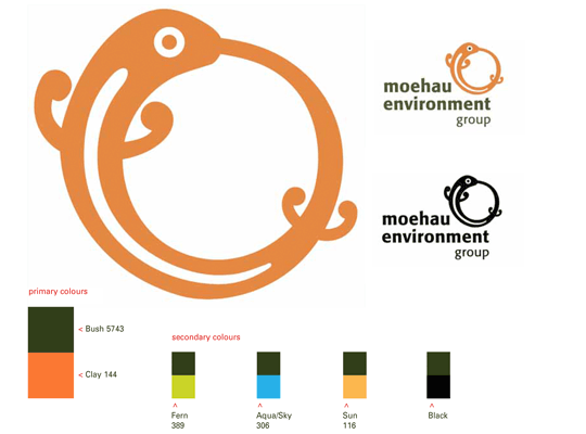
Logo: completely re-working the Coromandel Striped Gecko featured in the old logo and merging it with the ancient symbol of the Ouroborus.
Logotype: A lively, bold sans serif face.
Colours: A vibrant but natural palette of colours reflecting this environment. Cosideration of duotone as economic production method.
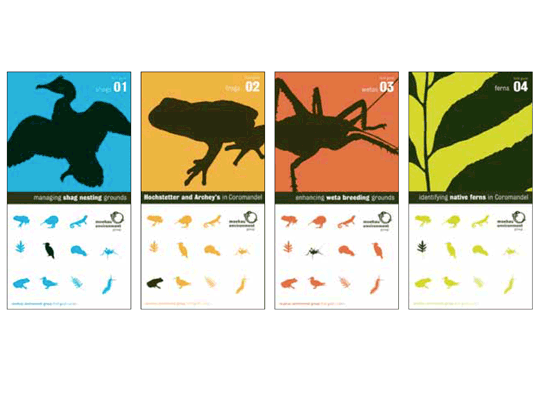
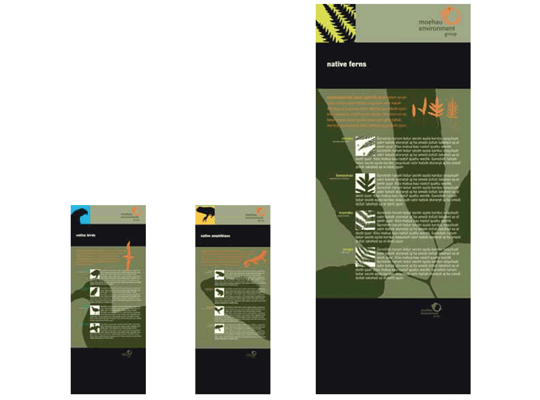
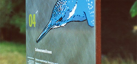
Other Elements: ‘Put the species to be protected as the stars themselves’: a silhouetted illustration-style of bold, appealing species-icons was developed.
Overall this gives the relatively small organization a memorable, compelling and professional identity.

