illume festival of lights
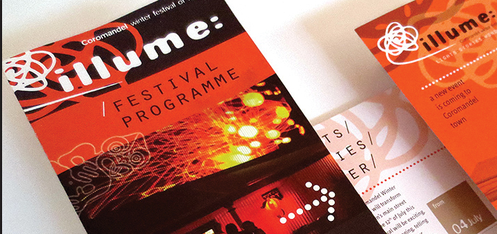
Brief// Logo development along with style elements and layout parameters as part of a visual identity for a new winter festival of lights in Coromandel town. Apply all this to items like poster, flyer, bill boards, as well as event programme.
Solution/ I-l-l in the word illume is a challenging sequence of letters because in many typefaces these are very similar. Furthermore, the word “illume” is not one of the most common words so it is not easily recognised by the eye. To improve readability, lower case was chosen as the i has a short line with a dot, and so is more easily distinguishable from the lower case L. This also supports the overall tonality.
The underlying idea is that of light and exposing a photo medium, as if taking a very long exposure photo, or slowly exposing an image onto photo paper. For this a very black, chunky typeface was required so the lines that make up the word won’t disappear in the process.
The colon at the end of the word illume resonates with the dot on the i. It lends something dynamic to the word and implies the beginning of something – a story, a performance, a movie…
The icon to go with the logotype resembles a free form that could have been drawn with a sparkler in the dark and recorded with a long exposure on a still camera, or written with a candle or a torch. It loosely forms a creative cloud, a flower, a swirl… The off stroke underlines and conects it with the logotype. Both logotype and icon work very well on black, but it was important that they also work well on light backgrounds to avoid being locked into always needing one or the other.
Background/ The festival is completely new, it is for all ages and is free. Audience is local as well as from nearby urban centres. They are looking for fun, something different, especially over winter.

