coromandel pier + railway
Brief// Brand development for the Coromandel Pier+Railway project
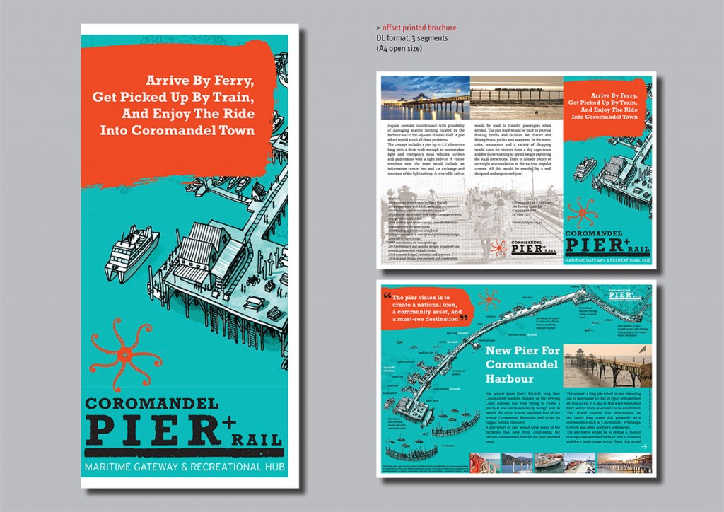
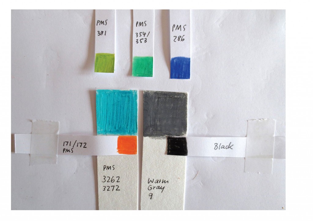
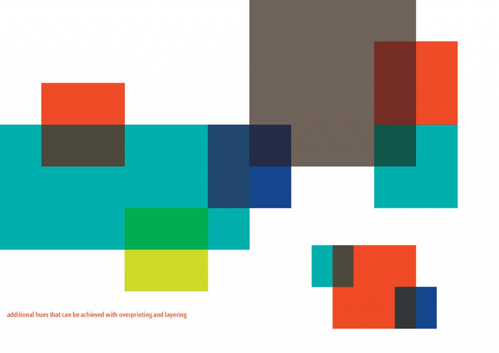
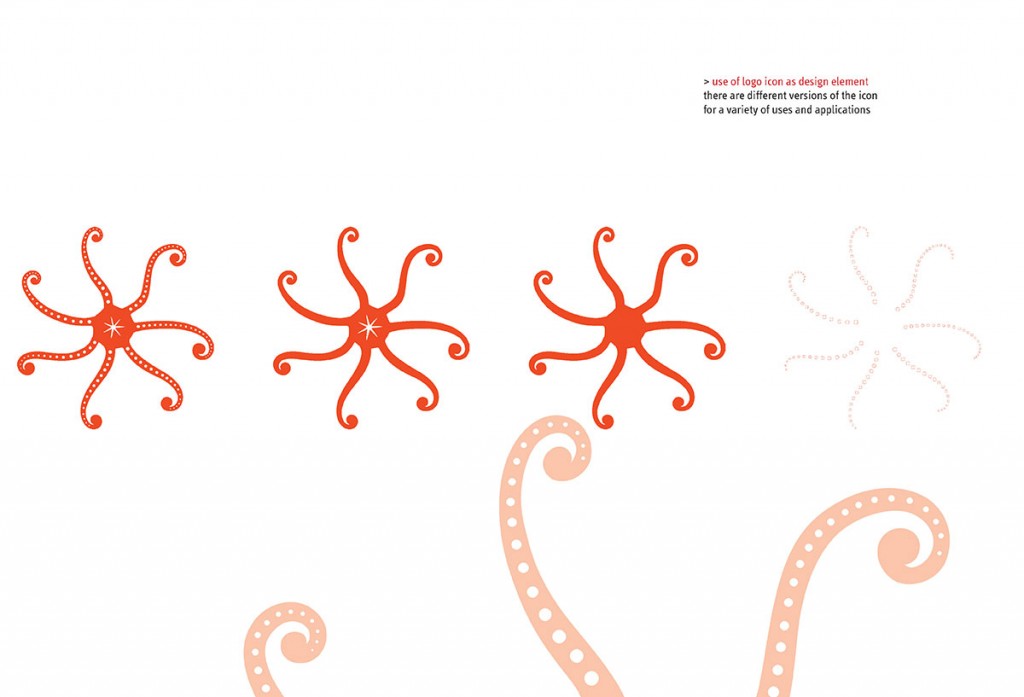
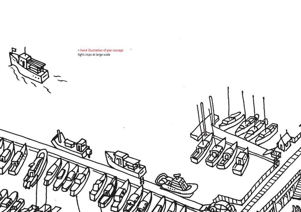
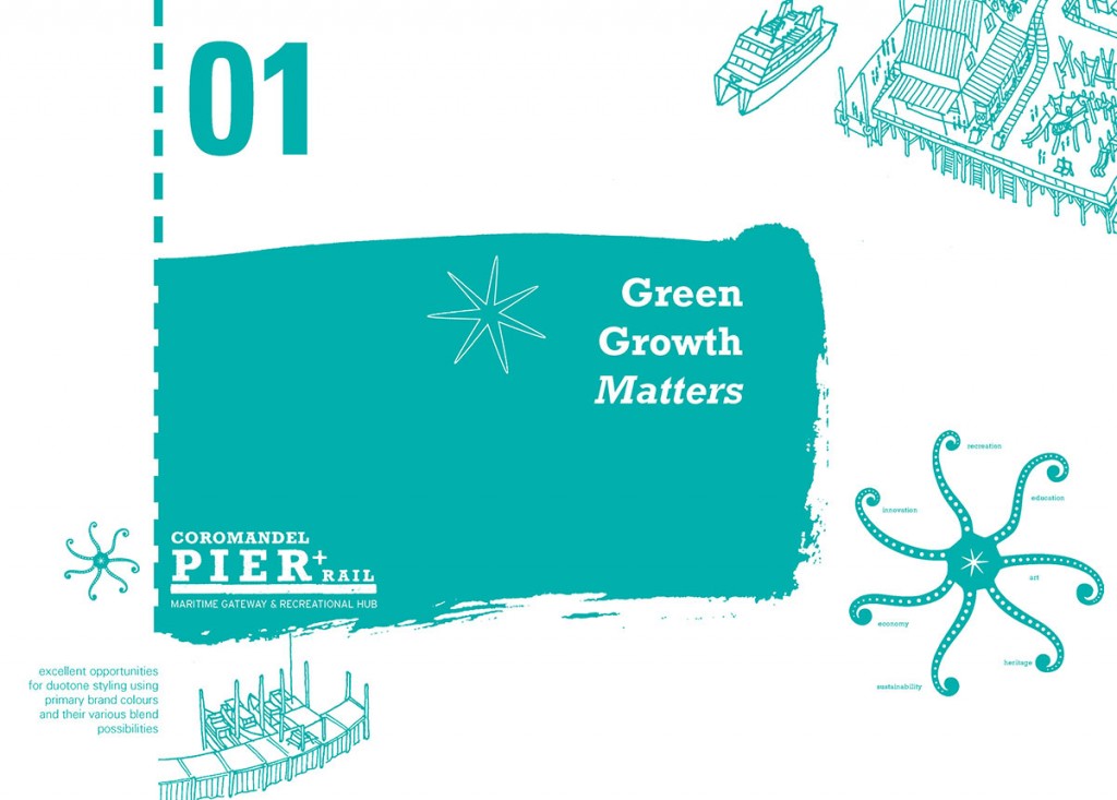
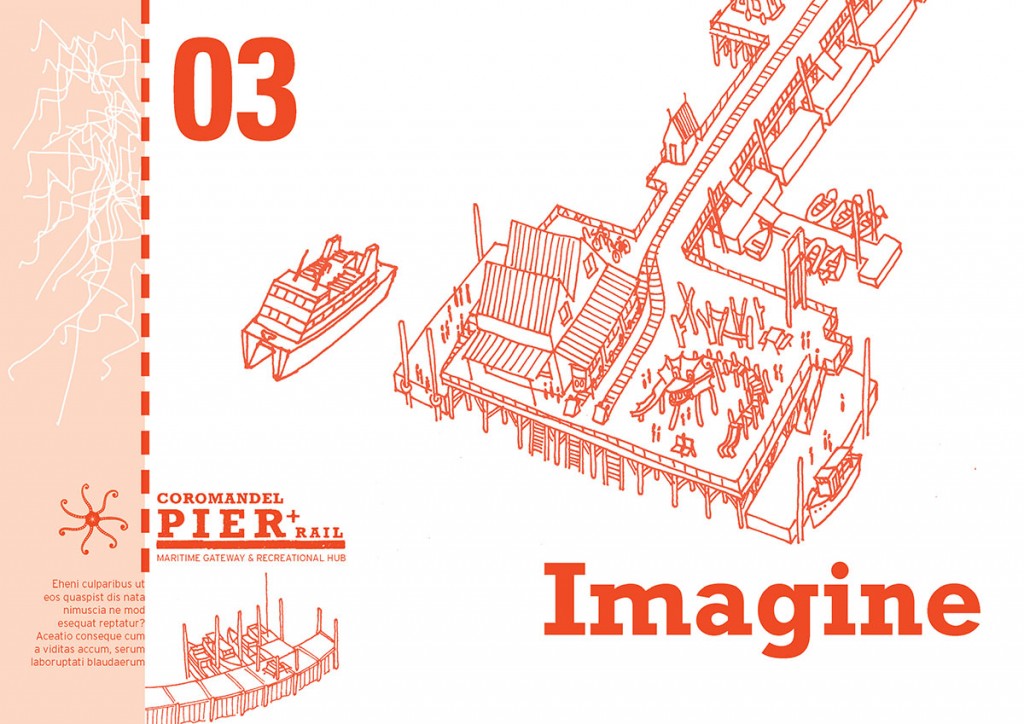
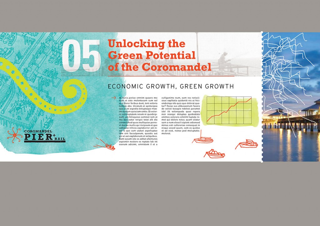
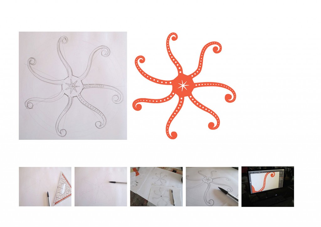
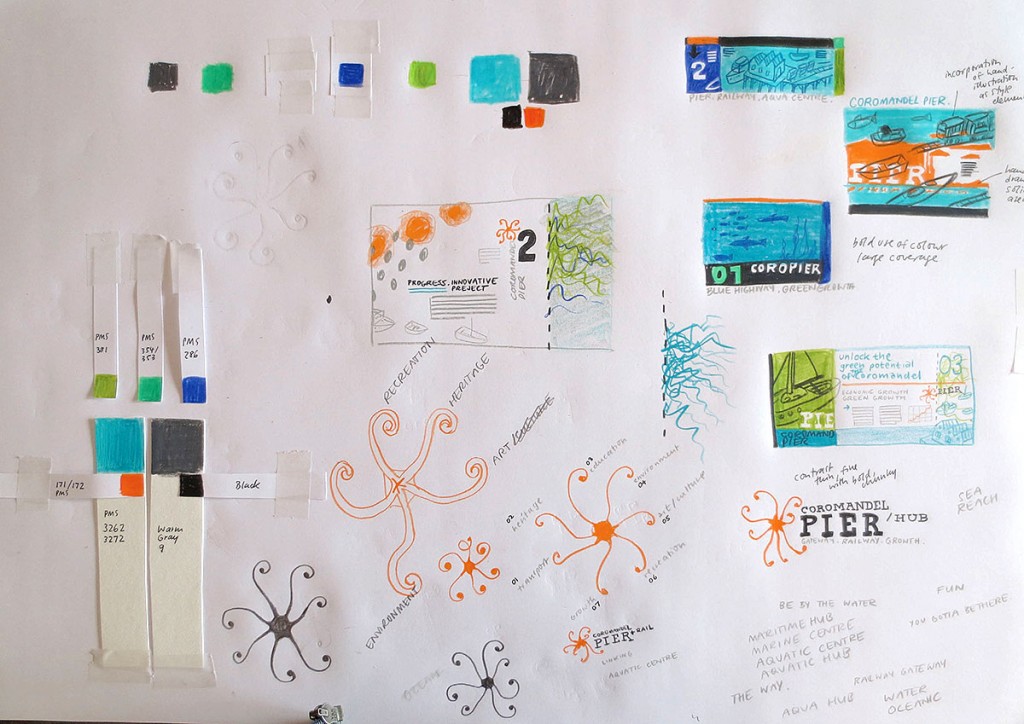
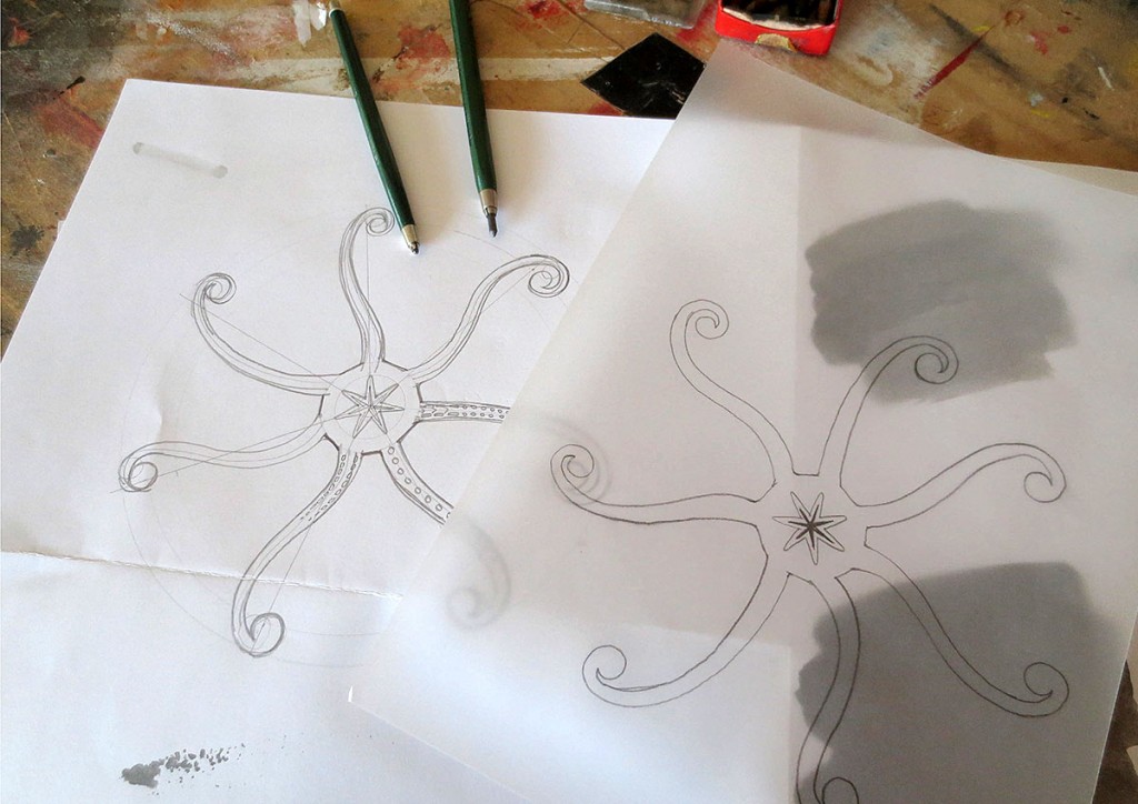
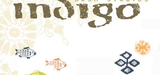
Solution/ A combination of a bold logotype paired with a fine logo. The ferris-wheel/ sea-star looking logo speaks about many of the Pier’s strenghts – connectivity, interconnectedness, connective quality. This applies to various levels like for example Auckland & Coromandel, land & sea, blue highway & green growth, utility and leisure, economy & art & culture & environment, and people & people. A range of unique colours with consideration to overprinting and transparency effects when combined. Strong maritime and railway connotations. To achieve a stronger positive bond between the brand and the audience the project was named according to what people have in their minds and how they are likely to refer to it rather than the “official” name. The previously developed hand illustration of the pier was integrated into the overall brand as it supported the desired tonality.
The brand with its diverse elements allows for great flexibility to support a great range of different communications to wildly different groups along the development of the project which are:
1 Funding bodies
2 Peninsula locals – business owners, community uses
3 Aucklanders – entertainment and commuters
4 Bach owners
5 National and international tourists
6 The Press
7 Regulatory Authorities and Other Organisations
Background/ The project was initiated by the late Barry Brickell, local rail enthusiast and artist. The vision of the Coromandel Pier + Rail is to extend the old wharf out into the harbour and linking it to town via a railway line, thus creating a destination, a community asset and a unique landmark for Coromandel that will stand alone.
The pier will extend the wharf into the deep water of the Coromandel Harbour. At 1.2 km it will be the longest pier in the country and the second longest in the Southern Hemisphere. It will have a railway on it, will be drivable, cyclable and walkable. It will enhance the character of the town and will have cultural, social and economic benefits.
After recognition through local council and the mayor, and while commissioning a serious business case through a marine engineering consultancy, a more professional and coherent brand was needed to lift the project to a more professional level.

