silverfish catalogue
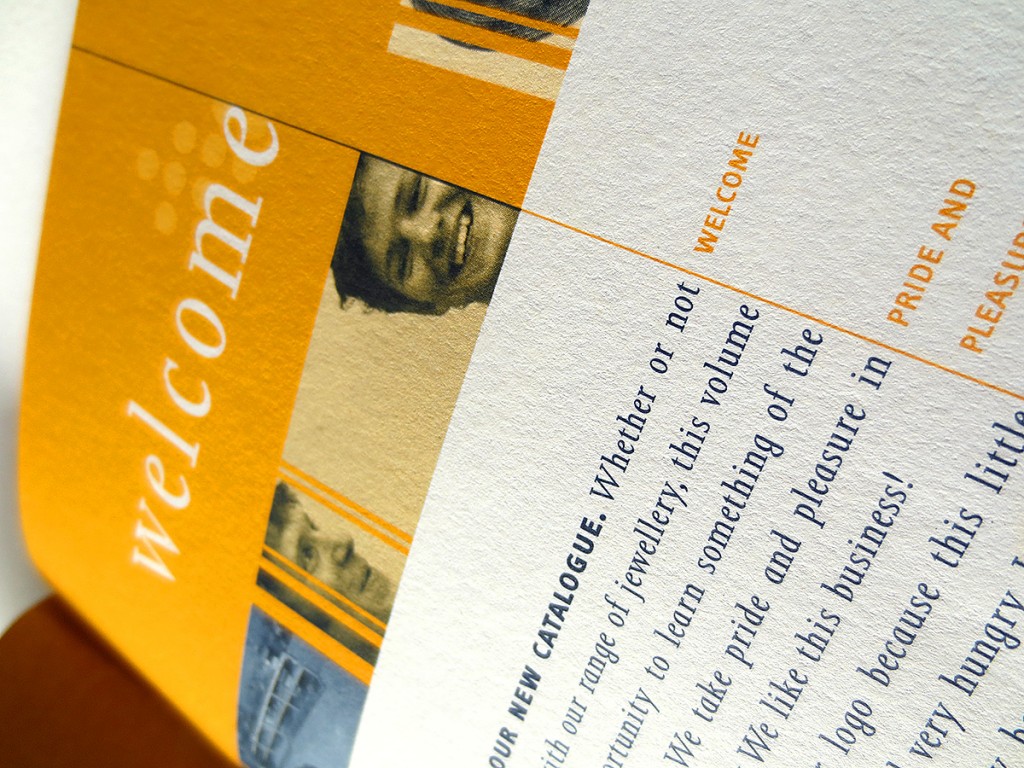
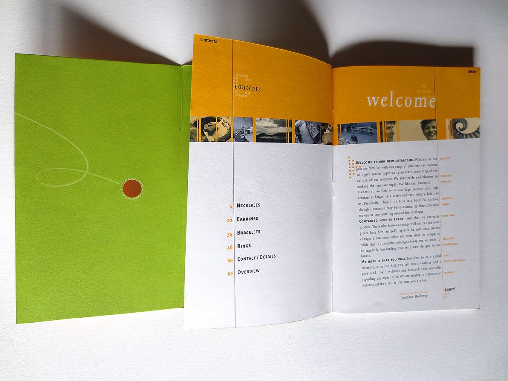
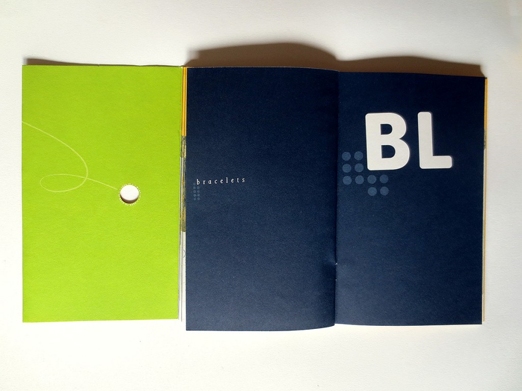
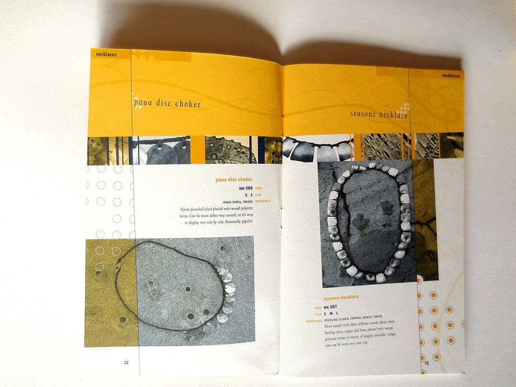
This catalogue is a so called duotone job, which means it is printed with 2 spot colours rather than full colour. Aside from helping save cost this enabled a superior aesthetic.
Aside from reflecting the jewellery studio’s philosophy more closely by being original, duotone further supplied a point of difference, something outside of the square which again supported Silverfish’s position.
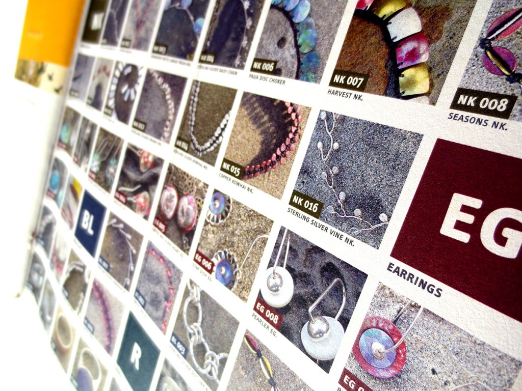
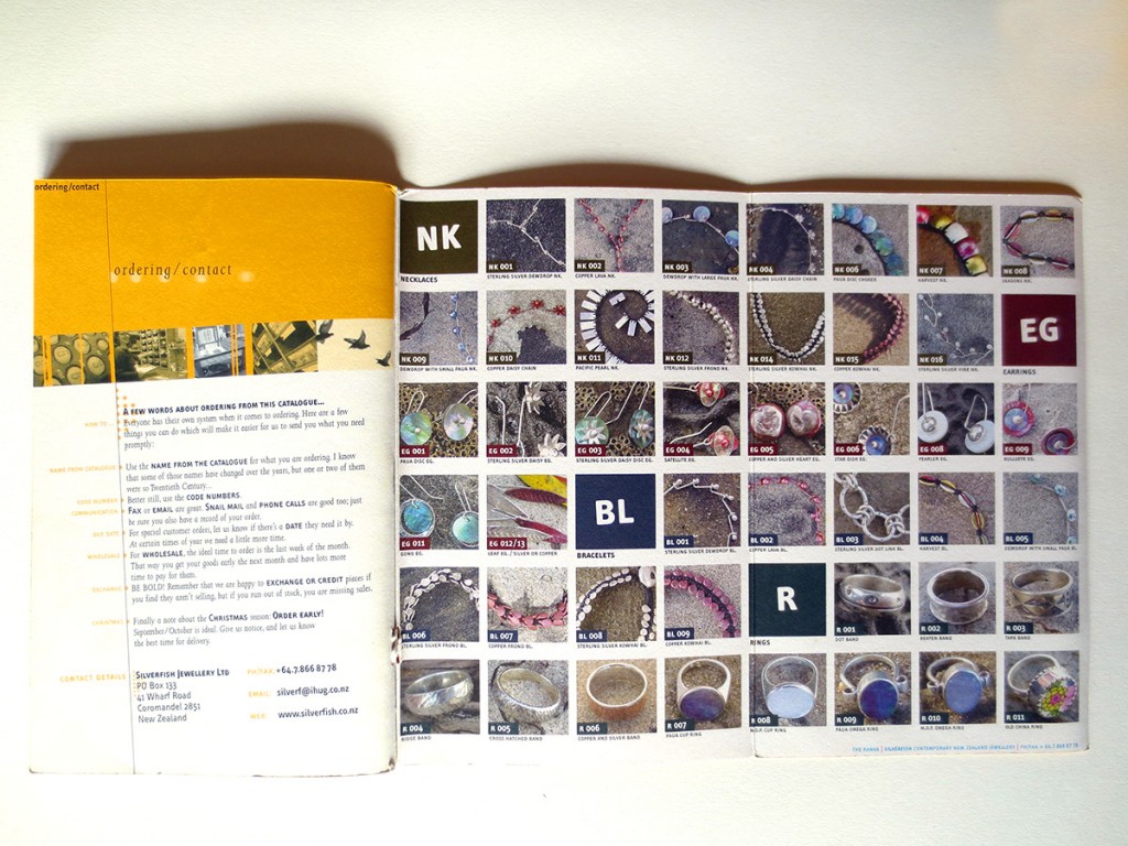
A full colour fold-out flap in the back cover functions as a colour reference index of all the pieces in the catalogue.
The individual items were taken back to the place where the jeweller finds most of his inspiration: nature. They were photographed in situ on the beach at Whangapoua, Coromandel. A small band of images spans through the entire publication with nature impressions and snapshots of work in progress at the studio. A series of abstract hand drawings with natural forms populates the top area of each spread.
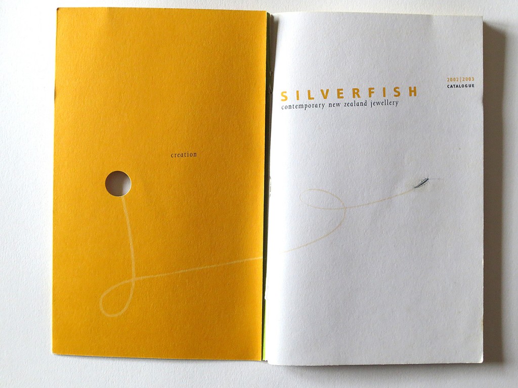
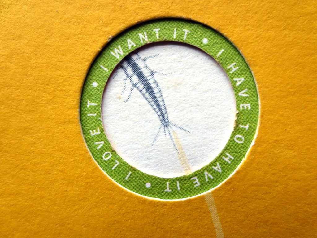
A die-cut double hole in the front cover featuring miniature type around the rim and the silverfish squiggling away into it required precision printing and especially finishing (Brebner Print). This along with the other fine aspects of the publication won it recognition at the 2003 Pride in Print Awards (environmental category).
This catalogue is printed on recycled paper. The use of 2 spot colours rather than full colour process printing reduced the amount of inks used.
more details on design considerations and process
At the time processor capacities were still limited. Black and white images were faster to process in Photoshop than RGB. While it didn’t inform design decisions this fact still made working on this job more pleasant. The reality is duotone is beautiful, it offers a multitude of design qualities full colour doesn’t, or where full colour simply emulates what originated as duotone style elements. It seemed more authentic to employ the original method.
Traditionally duotone was used as a technique to render black and white photographs more beautifully. Adding a second colour of a medium brightness like for example grey or beige or light brown and with a slightly altered curve allows to render a much greater range of tones, thus making the image smoother and deeper. It was later also used to simply add a colour tone to a black and white image, and again later to create striking effects by choosing strong, bold second colours rather than just grey or beige. When using duotone you don’t have to use black though, it is possible to choose any other colour for depth as long as it is dark enough. I enjoy using a combination of 2 distinctive colours which, when overprinted, will generate black or something very near. In this case I chose a very rich, dark blue paired with a vibrant, bright orange. This offers many hues of each colour, as well as a multitude of new colours if overprinted in varying percentages. It’s a lot of fun when you really get into it. Back then QuarkXPress was the page layout application everyone used. Unlike InDesign it didn’t offer mixing blends of spot colours, and transparency was unheard of. This meant simulating all possible combinations of percentages in a duotone file in Photoshop and then applying them in QuarkXPress by using 2 process colours as replacements. I even occasionally got sample duotone charts offset printed by my printers.

