coromandel town website


Brief// complete re-design of an exisiting website with a focus on improved utility and user experience, as well as total re-organisation of the very comprehensive content
Background: The Coromandel Town Information Centre is run by a charitable trust which has 2 main objectives: to promote tourism, and to serve the local community. The old website platform was very limited in it’s ability to be customised, and even more so in ways to structure the content. The two focus areas tourism and community had become all mixed up, plus the content had developed to such a size that it had clearly outgrown the practicality of the old system.
Solution: move the site from away from Weebly and completely re-create in WordPress, separate the two focus areas tourism and community, and set up a robust system in the background to better be able to organise the content.
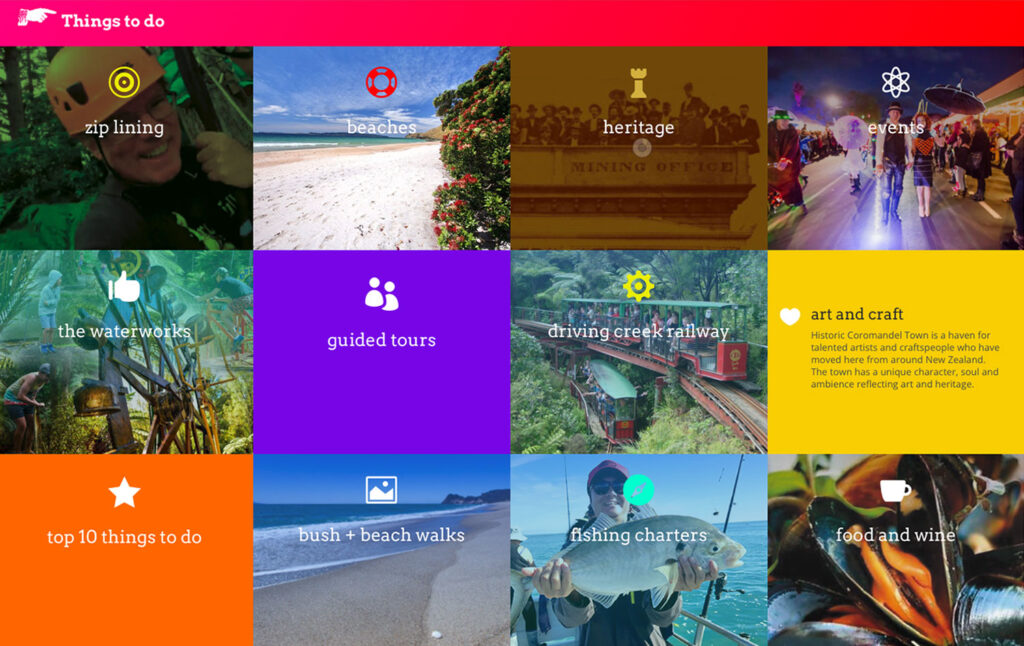
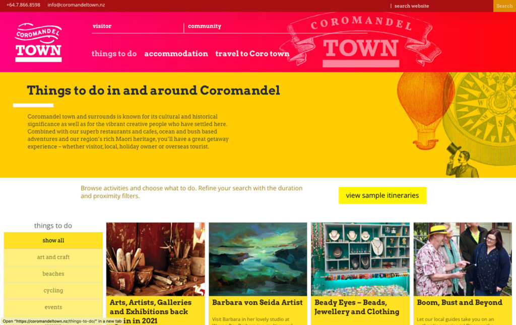
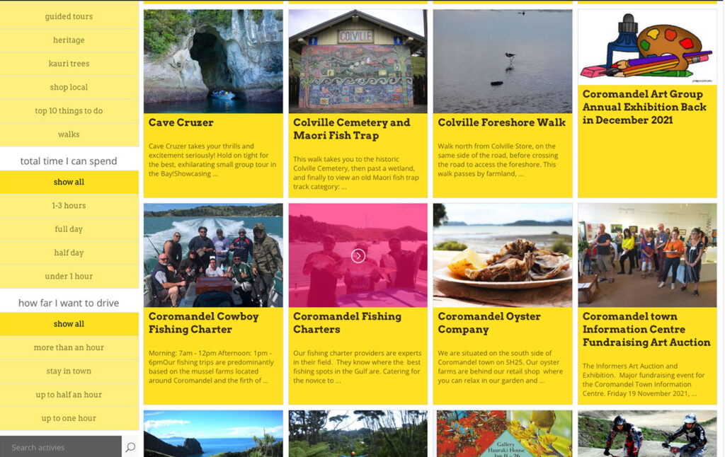
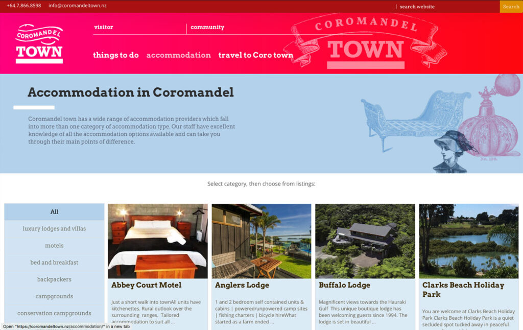
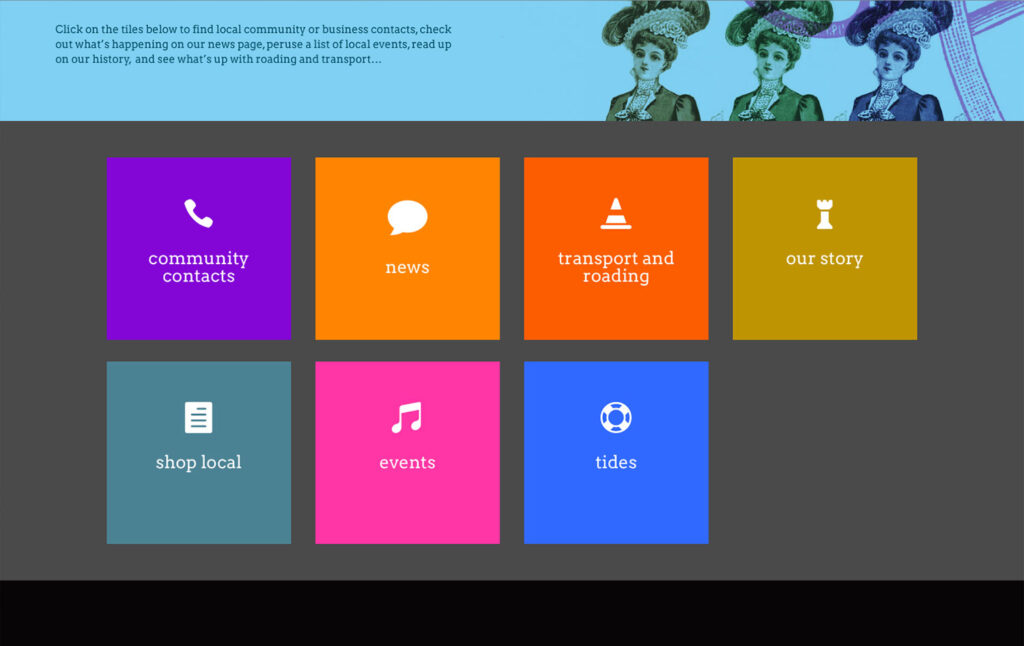
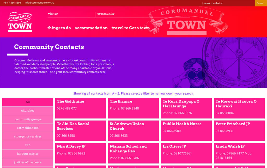
The entire, by now very complex content is treated as lots of individual WordPress posts with the use of associating categories and further custom taxonomies to make it highly filterable. According to the location on the website specific filters are applied to display very specific content only. In some instances users can set their own filters depending on their personal preferences to view exactly what they are looking for.
To improve design consistency, administrators who are not trained in communication design can use templates for different types of posts and simply drop in content, select categories and other taxonomy settings, and the post gets rendered and displayed accordingly.
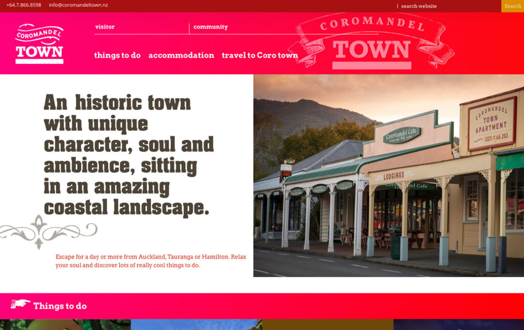
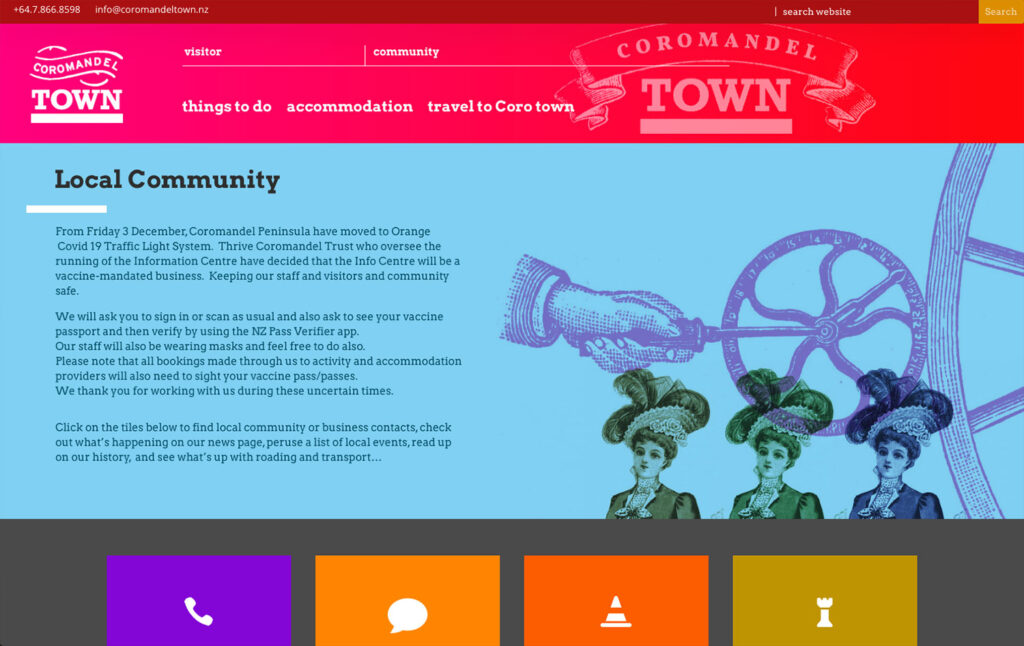
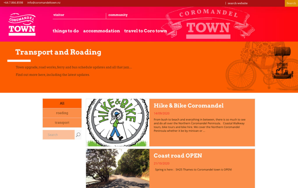
On the front end the content was split into two main areas – a visitor and a community area. According to where the user goes, only relevant content appears (just like domestic and international terminals at an airport are two distinctly different areas of the same airport).
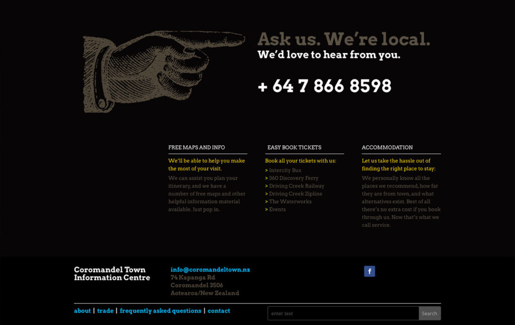
The design and overall look and feel references the town’s rich history in a modern, fun way. The navigation is deliberately simple, and in some places is location-specific. Depending on where on the site the user is, different menu items appear relating specifically to that unique location.
Again this is not unlike a guide system on a large airport pointing out locations specific to a particular gate only at that particular gate, not already at the main entrance of the airport as this would completely clutter up the way-finding signage/navigation.
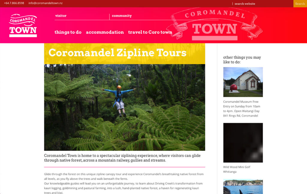
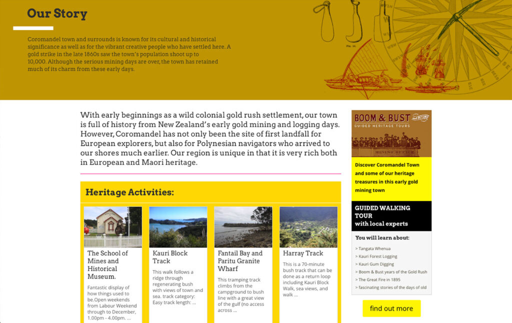
Different types of templates of varying scope and complexity have been prepared for the client. These reflect a range of different tiers of listing options for tourism operators and other local businesses and service providers. This content appears inline with everything else and relevant to user and specific location on the website. This has given the client a much better scope to distinguish between different types of clients, to better generate revenue, and to better place content in an appropriate context.
The structure, templates and some basic training have given the client a very powerful tool to independently self manage and grow their online presence, promote tourism for the town, as well as serve the local community.